/ 06 — Case study
Sensentia
Sensentia — Benefits Search & Dashboard
Redesigning how insurance teams search plans and read dense benefit details.
Sensentia is a health-insurance intelligence platform where benefits teams search across plans and read the fine print — co-pays, co-insurance, tiers, inclusions and exclusions — that decides what a member actually pays. I redesigned the two surfaces the whole product runs on: the benefits search and the results dashboard. The goal was to make a dense, high-stakes data tool feel fast, legible and trustworthy without losing any of the detail specialists depend on.
Overview
The two surfaces the product runs on — a guided benefits search and a scannable, filterable results dashboard. Click any screen to view it in full.
/ 01 — Overview
Problem
Searching for a benefit meant wrestling with an unforgiving query bar and then decoding a wall of a table — dozens of columns of co-pays, tiers, limits and conditions with no hierarchy. Filters were hard to find, empty and error states were dead-ends, and the density made a genuinely powerful tool feel intimidating and slow for the specialists who live in it all day.
Solution
A structured search that pairs a clear query bar with scoped filters (organization & project, plan type, plan features), and a results dashboard that stays dense but becomes scannable: tabbed provider tiers, an all-in-one filter panel, expandable rows that reveal co-pay, co-insurance, inclusions, exclusions and notes in a readable layout, and guided empty, loading and error states that always offer a next step.
/ 02 — Project details / at a glance
- Role
- Lead UX/UI Designer
- Client
- Sensentia (health-insurance intelligence)
- Product
- Benefits search & results dashboard (web app)
- Users
- Benefits analysts · Plan configurators · Insurance ops teams
- Focus
- Search UX · Data-dense tables · System states
- Tools
- Figma
/ 03 — My focus
Making dense data
feel effortless.
This wasn't a job of simplifying by removing — specialists need every column. My focus was hierarchy and flow: give the search real structure and scoped filters, turn the results wall into a scannable, expandable table, and design every system state (empty, loading, error) so the tool always tells you what to do next. The detail stays; the friction goes.
/ 05 — The work
A search built around how teams actually look
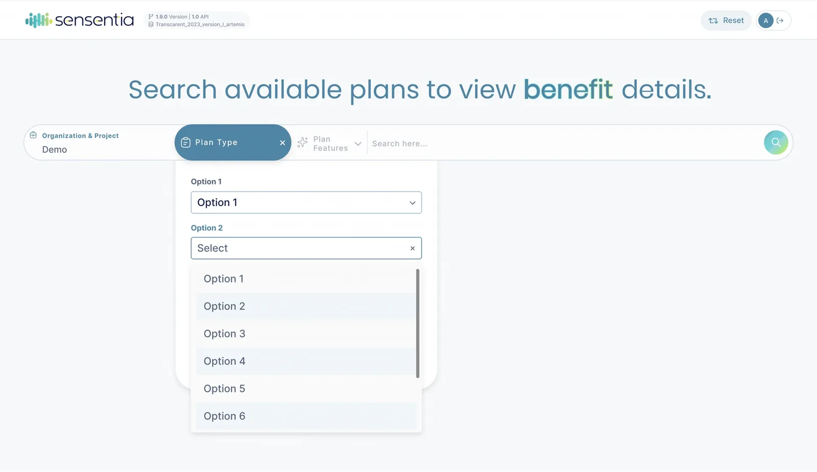
The entry point pairs a single clear query bar with scoped filters — organization & project, plan type, and plan features — so a specialist can narrow to the exact plan before running a search. Filtering is surfaced up front instead of buried, and each control has an obvious, consistent affordance.
States that guide instead of dead-ending
A data tool spends real time in empty, loading and error states — so each one was designed to keep the user moving. No-results explains why and offers one-tap ways to re-enable a filter or reset; the organization picker and loading state keep context visible; nothing leaves the user stuck.
Reading benefit details without the noise
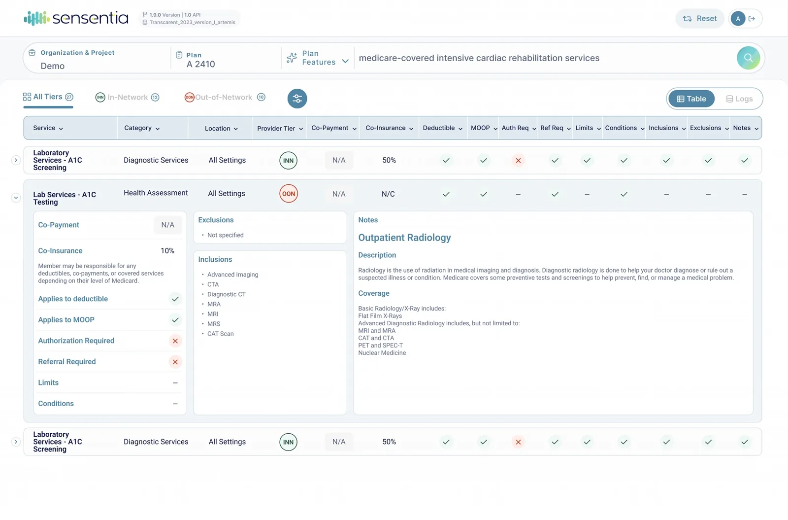
The results dashboard keeps every column specialists rely on, but adds the hierarchy it was missing: tabbed provider tiers (All / In-Network / Out-of-Network) with counts, sortable columns, and rows that expand into a clean three-panel detail — cost sharing on the left, inclusions and exclusions in the middle, and the full coverage note on the right.
/ 06 — Key decisions
Decisions that
cleared the noise.
A few choices made a dense, high-stakes tool feel calm and fast without hiding anything.
Kept the density, added the hierarchy
Rather than cut columns specialists need, I introduced tabs, grouping and expandable rows so the same data reads in layers instead of all at once.
Surfaced filtering up front
Search filters and an all-in-one filter panel are visible and grouped, so narrowing results is a first-class action, not a hunt.
Designed every system state
Empty, loading and error states each explain what happened and offer a clear next step, so the tool never dead-ends a user.
Made the detail readable
The expanded row splits cost sharing, inclusions/exclusions and coverage notes into a calm three-panel layout that reads like a brief.
/ 07 — Outcome
Dense data,
made legible.
The redesign turned an intimidating query-and-table tool into a structured workflow: search with intent, filter with confidence, and read benefit details without decoding a spreadsheet. Specialists reach the exact plan and coverage answer faster, the interface finally matches the sophistication of the data underneath it, and every state — from first search to no-results — keeps the user moving.
/ 08 — Reflection
The hard part of data-dense product design isn't making things pretty — it's respecting how much complexity the user genuinely needs while removing the friction around it. On Sensentia, the win was hierarchy: same depth, far less effort to read. That's the kind of restraint high-trust, regulated products reward.