/ 05 — Case study
IDX Broker
IDX Broker — Competitive UX Audit
Benchmarked against four competitors across five conversion funnels.
This UX benchmark evaluates IDX Broker against iHomeFinder, AgentFire, BoldTrail and Luxury Presence across the Signup, Plan Selection, Compare Plans, Take a Tour and Direct Order funnels. The objective: uncover usability gaps, surface missed conversion opportunities, and give a prioritised set of fixes to raise IDX Broker's competitive positioning.
/ 01 — Scope & method
What was benchmarked
Funnels
Competitors
How it was reviewed
Comparative heuristic evaluation — walking each funnel on IDX Broker and every competitor, logging where IDX falls short. Each finding is rated on a defined severity scale:
- CriticalBlocks or loses the conversion
- HighCauses drop-off
- MediumAdds friction
- LowPolish
Not in scope: no moderated user testing and no analytics access — findings are comparative expert evaluation, not behavioural proof.
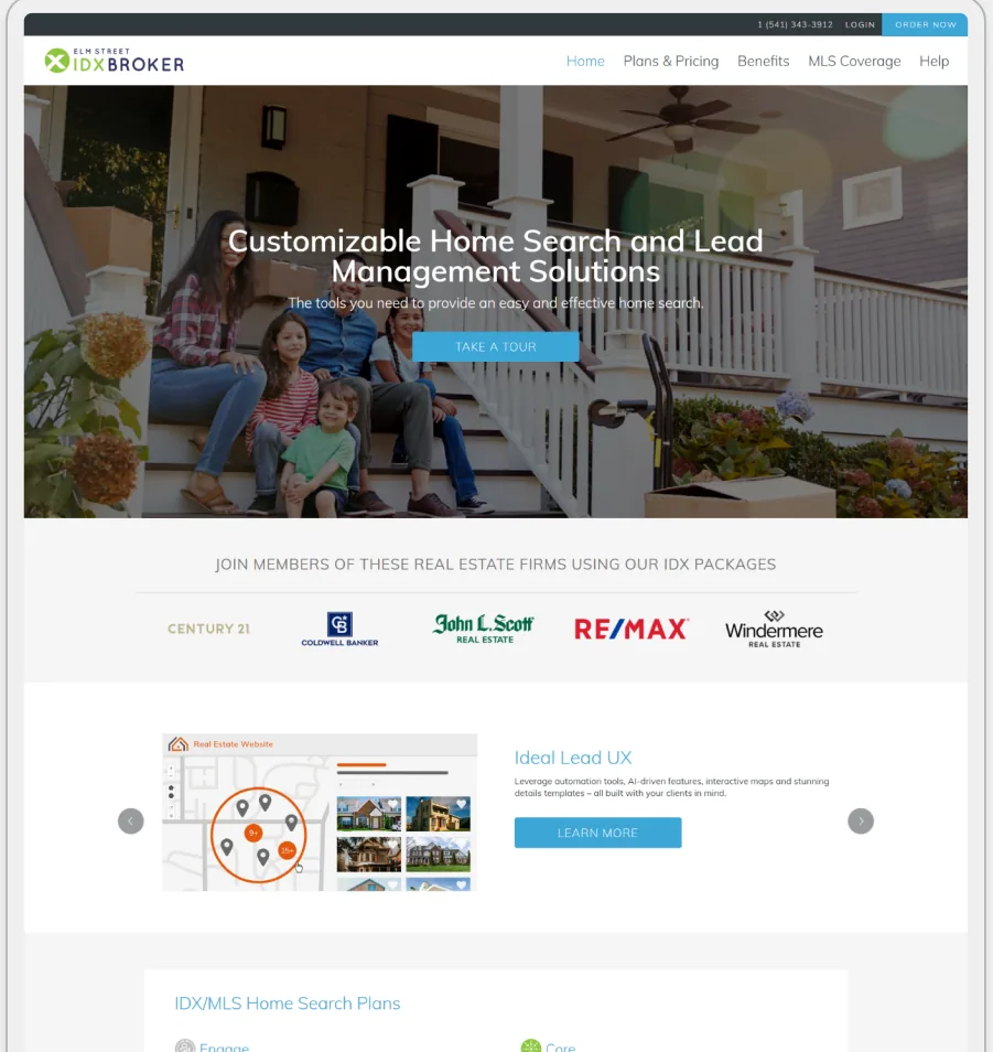
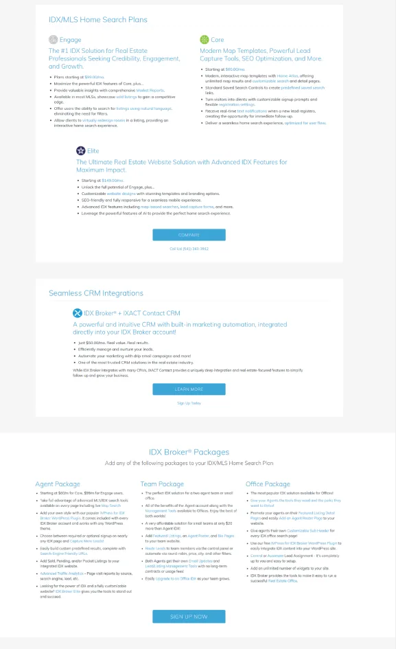
The product under review
/ 02 — Findings index
| ID | Funnel | Finding | Severity | Effort |
|---|---|---|---|---|
| F01 | Signup | Signup is one long form instead of staged steps. | Critical | M effort |
| F02 | Direct Order | Order flow has no progress, back navigation, or live price. | Critical | M effort |
| F03 | Compare Plans | Plan comparison is a dense long-text grid. | Critical | M effort |
| F04 | Plan Selection | Plans lack visual distinction and hierarchy. | High | M effort |
| F05 | Take a Tour | The product tour is passive and generic. | High | M effort |
| F06 | Plan Selection | Add-ons and upgrades aren't clearly delineated. | High | S effort |
| F07 | Signup | Hero overlays text on images, hurting readability. | High | S effort |
| F08 | General | Low-contrast blue text on white fails readability. | High | S effort |
| F09 | General | Inconsistent visual hierarchy across pages. | Medium | M effort |
| F10 | Take a Tour | Tour doesn't show user-specific filters or dynamic content. | Medium | M effort |
| F11 | General | UI feels dated and cluttered. | Medium | L effort |
| F12 | Plan Selection | Benefits are in a carousel users overlook. | Medium | S effort |
Signup is one long form instead of staged steps.
Signup
Order flow has no progress, back navigation, or live price.
Direct Order
Plan comparison is a dense long-text grid.
Compare Plans
Plans lack visual distinction and hierarchy.
Plan Selection
The product tour is passive and generic.
Take a Tour
Add-ons and upgrades aren't clearly delineated.
Plan Selection
Hero overlays text on images, hurting readability.
Signup
Low-contrast blue text on white fails readability.
General
Inconsistent visual hierarchy across pages.
General
Tour doesn't show user-specific filters or dynamic content.
Take a Tour
UI feels dated and cluttered.
General
Benefits are in a carousel users overlook.
Plan Selection
/ 03 — Findings in detail
Signup is one long form instead of staged steps.
Observation
New users hit a single, lengthy form demanding extensive information before any value is shown.
Why it matters
User: Perceived complexity and the upfront data ask make users abandon before they understand the product.
Business: High signup drop-off caps every downstream conversion.
Recommendation
Split signup into a lead-capture stage (email, name, 'Get started') and a later setup stage after the initial commitment.
Benchmark
AgentFire and BoldTrail stage their signup.
Order flow has no progress, back navigation, or live price.
Observation
Users can't see how many steps remain or how the total changes as they add options.
Why it matters
User: Uncertainty about cost and stage creates anxiety and cart abandonment.
Business: Opaque checkout directly loses completed orders.
Recommendation
Add a progress bar, back navigation, and a live price summary that updates as add-ons change.
Benchmark
BoldTrail's checkout is transparent and stepped.
Plan comparison is a dense long-text grid.
Observation
Features are compared as walls of text with no icons or scannable hierarchy.
Why it matters
User: Users can't compare plans at a glance, causing decision fatigue and low confidence.
Business: Hard comparison pushes users to a suboptimal plan or none at all.
Recommendation
Replace the text grid with icon-based feature rows, clear headings, and one column per plan.
Benchmark
iHomeFinder and Luxury Presence compare visually.
Plans lack visual distinction and hierarchy.
Observation
Tiers render without cards, badges, or grouping to separate them.
Why it matters
User: Users can't quickly identify the right plan and stall on the decision.
Business: Weak plan clarity lowers selection and upgrade rates.
Recommendation
Use a card layout per plan with distinct tiers, badges, and grouped, icon-led feature lists.
Benchmark
Competitors use badged pricing cards.
The product tour is passive and generic.
Observation
The tour lacks narration and role-specific paths.
Why it matters
User: Users don't grasp the platform's value, so adoption stays low.
Business: A skippable tour wastes the best moment to sell capability.
Recommendation
Add a narrated walkthrough and user-specific interactive paths (solo agent, team lead).
Benchmark
BoldTrail and Luxury Presence offer interactive demos.
Add-ons and upgrades aren't clearly delineated.
Observation
Add-ons lack labels, badges, and pricing clarity.
Why it matters
User: Users miss valuable add-ons or get confused about cost and purpose.
Business: Unclear upgrades leave revenue on the table.
Recommendation
Give add-ons a dedicated, clearly-labelled section with badges ('Popular') and tooltips.
Benchmark
Competitors badge and explain add-ons inline.
Hero overlays text on images, hurting readability.
Observation
The hero places copy over background imagery, reducing legibility and accessibility.
Why it matters
User: The core value message is missed or misread.
Business: A weak first impression drags top-of-funnel conversion.
Recommendation
Move to bold headings on a clean area or side-by-side layout with more whitespace.
Benchmark
Luxury Presence and AgentFire use clean hero layouts.
Low-contrast blue text on white fails readability.
Observation
Body text uses low-contrast blue on white backgrounds.
Why it matters
User: Users with low vision or poor lighting struggle to read content.
Business: Accessibility gaps risk compliance and erode trust.
Recommendation
Raise contrast to meet WCAG (≥4.5:1 for body text).
Benchmark
Baseline accessibility all competitors meet.
Inconsistent visual hierarchy across pages.
Observation
Headings, weights, and dividers are applied inconsistently.
Why it matters
User: Users can't tell what matters and navigate inefficiently.
Business: Slower comprehension reduces engagement site-wide.
Recommendation
Standardise headings, font weights, and section dividers into a clear type scale.
Benchmark
Competitors keep a consistent hierarchy.
Tour doesn't show user-specific filters or dynamic content.
Observation
The tour is one generic path for everyone.
Why it matters
User: Users don't see how the platform fits their role, lowering relevance.
Business: Generic tours convert worse than tailored ones.
Recommendation
Add short animated previews showing user-specific filters and settings in action.
Benchmark
Competitors tailor the demo by user type.
UI feels dated and cluttered.
Observation
Elements lack whitespace, depth, and modern iconography.
Why it matters
User: The platform reads as less professional than rivals.
Business: Dated UI weakens brand perception and trust at decision time.
Recommendation
Introduce whitespace, soft shadows, and clean icons as a reusable component pattern.
Benchmark
Competitors present a modern, uncluttered UI.
Benefits are in a carousel users overlook.
Observation
Key benefits sit inside a rotating carousel.
Why it matters
User: Carousels are skipped, so the value proposition is missed.
Business: Buried benefits weaken the case to buy.
Recommendation
Replace the carousel with a static, scannable benefits grid with icons.
Benchmark
Competitors use static benefit grids.
/ 04 — Funnel teardown
IDX Broker vs. the field.
Each product was walked through Sign-up, Tour, Order / Pricing and Visual & Layout — green marks what works, red marks where it loses users. Click any board to enlarge.
IDX Broker
The audited product — signup reads like an order form, pricing is a dense grid, and the hero has low-contrast overlay text.
BoldTrail
Staged signup, a transparent stepped checkout, and a strong, modern visual system.
AgentFire
Booking-first funnel, modular feature layout, and embedded demos shown in context.
Luxury Presence
A minimal, high-trust form and polished layout — though no public pricing or self-serve tour.
What good looks like
The patterns IDX Broker should borrow.
Four moves competitors already get right — and exactly how each one translates into a concrete fix for IDX Broker.
Badged, icon-led tiers let a buyer compare features at a glance instead of reading a wall of text.
Apply to IDX Broker
Rebuild IDX's plan grid as three icon-led cards with a highlighted 'most popular' tier.
Design first, then plan — one decision per step keeps cognitive load low and momentum high.
Apply to IDX Broker
Split IDX's order flow into staged steps with a running summary of what's selected so far.
A short, contextual capture step replaces one long order screen and cuts early drop-off.
Apply to IDX Broker
Lead with a quick email + name capture, then move detailed setup to after the first commitment.
A bold headline on a clean area with real whitespace makes the value obvious in seconds.
Apply to IDX Broker
Drop the stock-photo text overlay; use a bold headline block beside a single product visual.
/ 05 — Impact vs. effort
Where to start.
Every finding plotted by expected impact against effort to fix. Hover or tap a dot. Top-left — high impact, low effort — is where IDX Broker should start.
/ 06 — Reflection
Benchmarking isn't about copying competitors — it's about seeing, funnel by funnel, exactly where a product loses the users its rivals keep. IDX Broker's gaps were clear and mostly fixable; the value was ranking them so the team knows what to fix first.