/ 04 — Case study
FishCaddy
FishCaddy — UX Audit
A heuristic audit of a fishing-report platform — every finding logged, ranked, and sequenced.
FishCaddy helps anglers track stockings, log reports, and follow their favorite waters. I reviewed the key user-facing surfaces against established usability heuristics, logged each issue with a severity and effort estimate, and turned the result into a prioritized plan a small team can act on this week.
/ 01 — Scope & method
What was reviewed
- Landing / homepage — hero, stocked waters, latest reports
- Onboarding — the follow-your-spots flow and empty states
- Dashboard & navigation — global nav and content discovery
- Location pages — Kern River & Lake Sonoma, tabs and widgets
- Newsletter — hero prompt and weekly digest content
- Coverage: desktop web (primary), responsive breakpoints spot-checked
How it was reviewed
Heuristic evaluation against Nielsen's 10 usability heuristics. Each finding is rated on a defined severity scale:
- CriticalBlocks the task
- HighCauses drop-off
- MediumAdds friction
- LowPolish
Not in scope: no moderated user testing and no analytics access — findings are expert-evaluation hypotheses, not behavioural proof. Where a fix is testable, I've named the metric that would confirm it (see “What I'd measure”).
/ 02 — Findings index
| ID | Screen | Finding | Heuristic | Severity | Effort |
|---|---|---|---|---|---|
| F01 | Homepage | Counties and lakes are buried in the hamburger menu and long scroll. | Recognition rather than recall | Critical | M effort |
| F02 | Homepage | Red 'alert' styling used on a newsletter banner where there is no error. | Match between system and the real world | Critical | S effort |
| F03 | Onboarding | Onboarding under-sells its value; 'Skip' is prominent and 'Continue' is weak. | Visibility of system status | Critical | M effort |
| F04 | Homepage | Interactive actions (Comment, Share) have no hover or click affordance. | Consistency and standards | High | S effort |
| F05 | Onboarding | Empty states ('Not following', empty 'My Reports') are passive dead-ends. | Help users recognise and recover | High | M effort |
| F06 | Location page (Kern River) | Multiple competing primary CTAs on the location page. | Aesthetic and minimalist design | High | S effort |
| F07 | Newsletter — content | Newsletter is one dense block — no dividers, summaries, or mid-content CTA. | Aesthetic and minimalist design | High | M effort |
| F08 | Homepage | Hero value proposition and secondary CTA are weak. | Match between system and the real world | High | S effort |
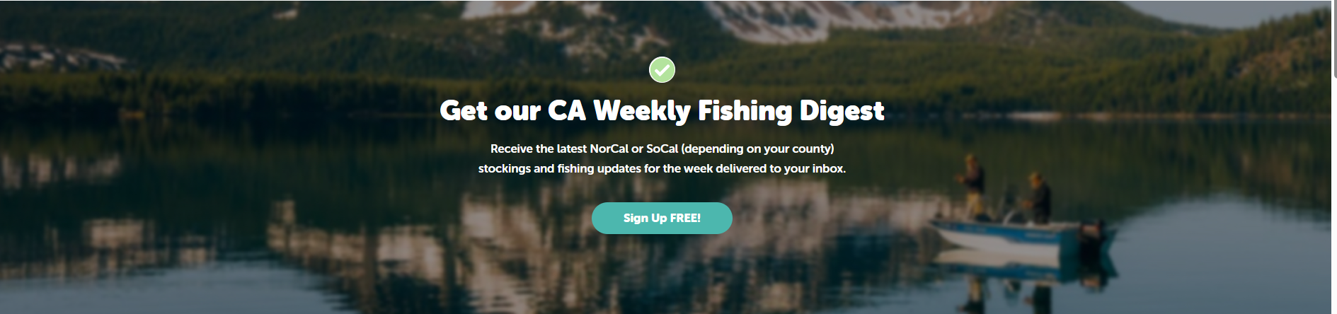
| F09 | Newsletter — hero | Newsletter hero uses a checkmark that implies the user is already subscribed. | Match between system and the real world | High | S effort |
| F10 | Location page (Kern River) | Fishing reports — the page's most valuable content — sit far below the fold. | Recognition rather than recall | High | M effort |
| F11 | Homepage | 'Recently Stocked Waters' and 'Latest Fishing Reports' use near-identical cards. | Consistency and standards | Medium | M effort |
| F12 | Location page (Kern River) | Long location description has no truncation or 'Read more'. | Aesthetic and minimalist design | Medium | S effort |
| F13 | Location page (Lake Sonoma) | Section titles and side widgets are inconsistent across tabs. | Consistency and standards | Medium | M effort |
| F14 | Onboarding | The follow list has no sorting or filtering. | Flexibility and efficiency of use | Medium | S effort |
| F15 | Location page (Kern River) | Map and utility widgets aren't standardised into a reusable pattern. | Consistency and standards | Medium | L effort |
Counties and lakes are buried in the hamburger menu and long scroll.
Homepage · Recognition rather than recall
Red 'alert' styling used on a newsletter banner where there is no error.
Homepage · Match between system and the real world
Onboarding under-sells its value; 'Skip' is prominent and 'Continue' is weak.
Onboarding · Visibility of system status
Interactive actions (Comment, Share) have no hover or click affordance.
Homepage · Consistency and standards
Empty states ('Not following', empty 'My Reports') are passive dead-ends.
Onboarding · Help users recognise and recover
Multiple competing primary CTAs on the location page.
Location page (Kern River) · Aesthetic and minimalist design
Newsletter is one dense block — no dividers, summaries, or mid-content CTA.
Newsletter — content · Aesthetic and minimalist design
Hero value proposition and secondary CTA are weak.
Homepage · Match between system and the real world
Newsletter hero uses a checkmark that implies the user is already subscribed.
Newsletter — hero · Match between system and the real world
Fishing reports — the page's most valuable content — sit far below the fold.
Location page (Kern River) · Recognition rather than recall
'Recently Stocked Waters' and 'Latest Fishing Reports' use near-identical cards.
Homepage · Consistency and standards
Long location description has no truncation or 'Read more'.
Location page (Kern River) · Aesthetic and minimalist design
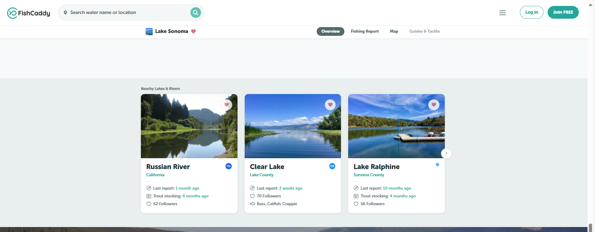
Section titles and side widgets are inconsistent across tabs.
Location page (Lake Sonoma) · Consistency and standards
The follow list has no sorting or filtering.
Onboarding · Flexibility and efficiency of use
Map and utility widgets aren't standardised into a reusable pattern.
Location page (Kern River) · Consistency and standards
/ 03 — Findings in detail
 01
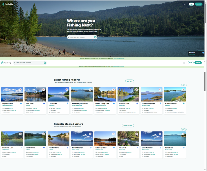
01Counties and lakes are buried in the hamburger menu and long scroll.
Observation
Core browse pages (counties, lakes) are only reachable via the hamburger menu or by scrolling past the fold; there's no persistent primary or secondary navigation to them.
Why it matters
User: Users can't tell what's available and must remember where things live, so they stop exploring after one or two pages.
Business: Fewer location page views per session directly caps the follows, reports and newsletter signups that depend on those pages.
Recommendation
Promote counties and lakes into a persistent nav (a mega-menu or secondary bar) so any water is reachable from anywhere in two clicks.
02Red 'alert' styling used on a newsletter banner where there is no error.
Observation
The newsletter prompt and several labels use error-red, a colour users read as 'something is wrong'.
Why it matters
User: Red creates false urgency and tension on a friendly prompt, so users dismiss it instead of engaging.
Business: A mis-signalled signup banner suppresses newsletter conversion — a primary retention channel.
Recommendation
Reserve red for true errors only. Restyle the banner as a positive, branded CTA card with an inviting visual.
 03
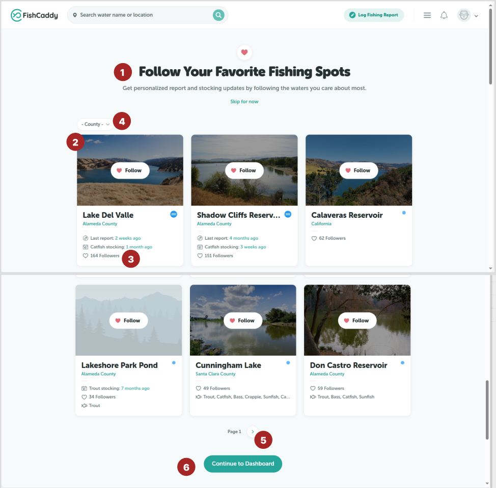
03Onboarding under-sells its value; 'Skip' is prominent and 'Continue' is weak.
Observation
The follow step leads with a generic title, gives 'Skip for now' equal weight, and ends on a flat 'Continue to Dashboard' button.
Why it matters
User: New users don't understand why following matters, so they skip the one action that makes the product feel alive on session two.
Business: Skipped follows mean empty dashboards and a second session with nothing to return for — the core activation leak.
Recommendation
Lead with the payoff of following, de-emphasize 'Skip', add social proof, and make the primary CTA benefit-driven ('Show my spots').
04Interactive actions (Comment, Share) have no hover or click affordance.
Observation
Action links on report cards don't change on hover and don't look pressable.
Why it matters
User: Users can't tell what's clickable, so engagement actions go unnoticed.
Business: Lower interaction on reports weakens the community loop that keeps anglers coming back.
Recommendation
Give every action a consistent hover state and button styling; make Follow / Comment / Share obviously tappable.
05Empty states ('Not following', empty 'My Reports') are passive dead-ends.
Observation
Empty states show a bare label with no illustration, benefit copy, or first action.
Why it matters
User: The most teachable moment is wasted; users see a blank and leave without a next step.
Business: Empty dashboards on first visit are a direct driver of one-and-done sessions.
Recommendation
Turn each empty state into a prompt: a friendly visual, one line of benefit, and a single clear action ('Follow your first spot').
 06
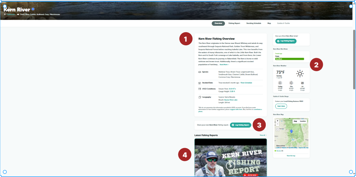
06Multiple competing primary CTAs on the location page.
Observation
The location header stacks several equally-weighted buttons, so no single next step stands out.
Why it matters
User: Choice overload — users hesitate instead of taking the key action (log a report / follow).
Business: Diluted CTAs lower the report-submission and follow rates the page exists to drive.
Recommendation
Keep one primary CTA ('Log Report'); demote the rest to secondary or icon buttons.
 07
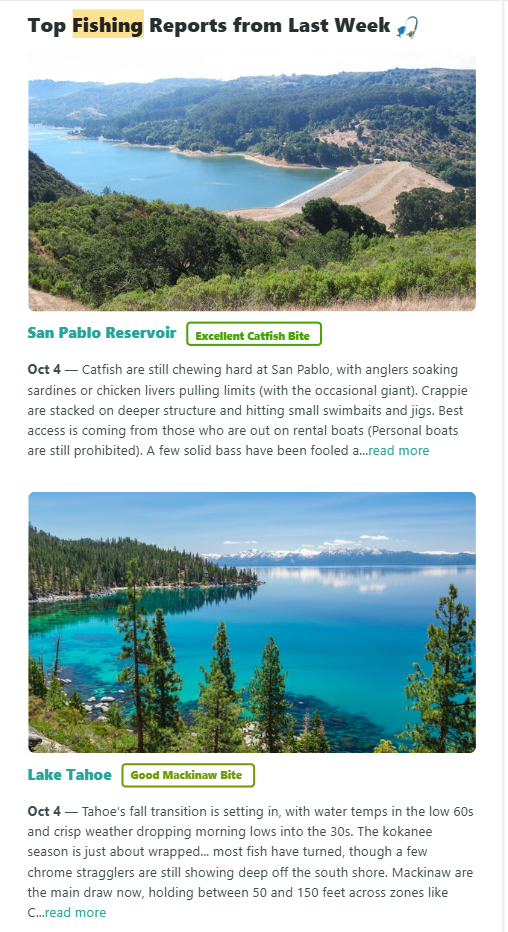
07Newsletter is one dense block — no dividers, summaries, or mid-content CTA.
Observation
Sections run together with no visual breaks and a single CTA only at the very end.
Why it matters
User: Readers skim, lose the thread, and never reach the one CTA at the bottom.
Business: Low newsletter click-through means the retention channel underperforms.
Recommendation
Add section dividers and one-line summaries, and place a 'Log your report' CTA mid-newsletter, not just at the end.
08Hero value proposition and secondary CTA are weak.
Observation
The hero leads with a search field but never states what FishCaddy does or offers a clear secondary path.
Why it matters
User: First-time visitors don't grasp the value quickly enough to commit.
Business: A vague hero lowers top-of-funnel conversion into signups and follows.
Recommendation
Add a one-line value statement above the search and a clear secondary CTA ('Browse waters').
 09
09Newsletter hero uses a checkmark that implies the user is already subscribed.
Observation
A green checkmark sits next to the subscribe prompt, signalling completion.
Why it matters
User: Users think they're already signed up and don't subscribe.
Business: The misleading signifier suppresses new subscriptions.
Recommendation
Replace the checkmark with an inviting visual and a clear, unfinished-state subscribe CTA.
10Fishing reports — the page's most valuable content — sit far below the fold.
Observation
Long description and widgets push community reports well down the page.
Why it matters
User: Users miss the freshest, most useful content and bounce.
Business: Buried reports reduce engagement and repeat visits to location pages.
Recommendation
Lift recent reports higher; collapse the long description behind 'Read more'.
11'Recently Stocked Waters' and 'Latest Fishing Reports' use near-identical cards.
Observation
Two different content types share the same card layout back-to-back.
Why it matters
User: Cognitive fatigue — users can't tell the sections apart at a glance.
Business: Blurred sections lower scanning efficiency and engagement with each.
Recommendation
Differentiate the two sections with distinct card treatments, headers, or layout.
12Long location description has no truncation or 'Read more'.
Observation
A multi-paragraph description renders in full at the top of the page.
Why it matters
User: Wall of text delays users from reaching the interactive content.
Business: Slower time-to-value on the highest-traffic page type.
Recommendation
Truncate to two lines with a 'Read more' toggle.
 13
13Section titles and side widgets are inconsistent across tabs.
Observation
'Nearby Lakes & Rivers' and utility widgets use different titling and styling from the rest of the page.
Why it matters
User: The page feels bolted together, eroding trust in the data.
Business: Inconsistency undermines perceived credibility of a data product.
Recommendation
Standardise section titles and widget styling across all tabs.
14The follow list has no sorting or filtering.
Observation
Spots appear in a fixed order with no way to sort by distance or region.
Why it matters
User: Users can't quickly find their local waters to follow.
Business: Harder discovery means fewer follows completed during onboarding.
Recommendation
Add simple sort/filter (by region or distance) to the follow step.
15Map and utility widgets aren't standardised into a reusable pattern.
Observation
Weather, bite-meter and map widgets each use different framing and spacing.
Why it matters
User: Scanning the side rail takes longer than it should.
Business: Ad-hoc widgets slow future page work and dilute the brand system.
Recommendation
Define one widget pattern (header, padding, states) and apply it across the rail.
/ 04 — Impact vs. effort
Where to start.
Every finding plotted by expected impact against effort to fix. Hover or tap a dot to see the finding. The top-left quadrant — high impact, low effort — is where FishCaddy should start.
/ 05 — Prioritised roadmap
Ship this week
High-impact, low-effort quick wins — CTA and colour fixes that lift engagement with no rebuild.
Next sprint
The activation core — navigation, onboarding, empty states and content order that drive the second session.
/ 06 — What I'd measure
Framed as hypotheses, not promises.
Without analytics access I can't claim outcomes — but each priority fix maps to a metric that would prove whether it worked.
Leading with value and de-emphasizing 'Skip' increases the share of new users who follow at least one spot.
Surfacing counties and lakes in navigation increases how many waters a visitor views per session.
Actionable empty states raise the share of new users who follow a spot and submit their first report.
Dividers, summaries and a mid-newsletter CTA increase clicks back into the product from email.
/ 07 — Reflection
A good audit isn't a list of opinions — it's a ranked, honest read on where a product loses people and what it costs. FishCaddy didn't need a redesign; it needed the leaks named and prioritised.