/ 02 — Case study
Dialogue
Dialogue — Turning Books Into Action
An AI audiobook app that turns the wisdom inside books into personalized advice and action plans.
I joined a product already in motion. My role was to design its AI feature flows, define the UX logic behind new capabilities, and redesign an onboarding that wasn't showing users why the app was worth their time.
Mobile app
/ 01 — Overview
Problem
The app had a powerful idea — personalized guidance drawn from books — but the experience didn't communicate it. The existing onboarding walked users through generic setup steps without ever showing the core value, so people arrived at the home screen with no idea what made Dialogue different from a standard audiobook app. The AI capabilities also needed clear, intuitive flows to feel usable rather than gimmicky.
Solution
I redesigned the onboarding to lead with value — showing users what Dialogue does for them early — and designed the AI feature flows that turn a book into personalized advice and action, alongside polishing the existing UI so the new capabilities felt native to the product.
/ 02 — Project details / at a glance
- Role
- UX Strategy · AI Feature Design · Onboarding Redesign
- Type
- Existing product, new features
- Platform
- iOS & Android
- Domain
- Audio / AI mobile app
- Tools
- Figma · FigJam · Maze
- Timeline
- 2025 · ~8 weeks
/ 03 — My focus
Making AI features
feel effortless.
Designing the AI feature flows, defining the UX logic behind new capabilities, redesigning onboarding to lead with value, and polishing the existing design as new features were introduced — so everything shipped as one coherent, intuitive product.
/ 05 — The work
Designing the AI feature flows
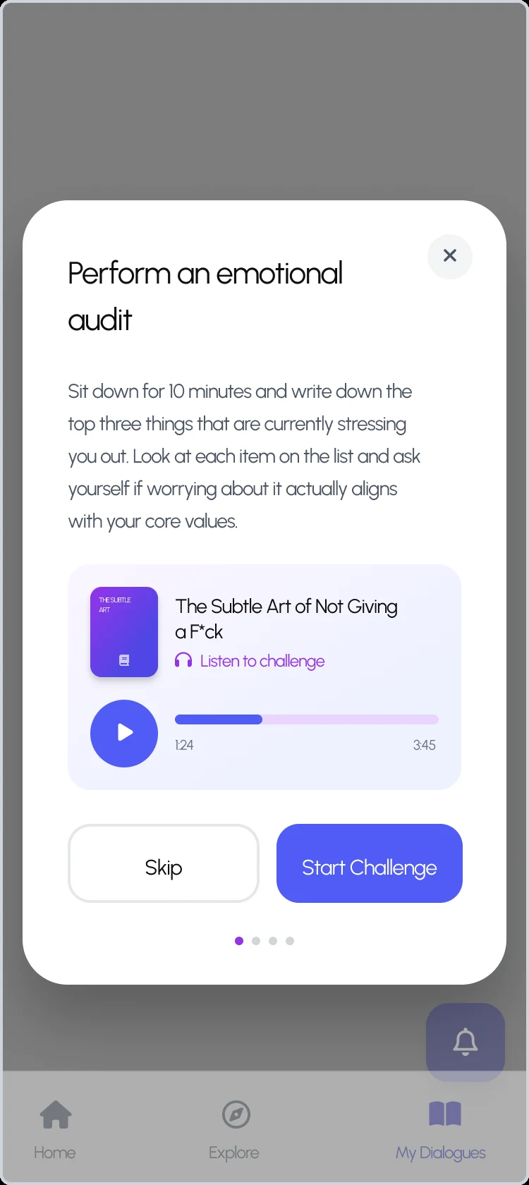
The new capabilities that let users ask a book questions and receive personalized advice and action plans — I designed how these flows are entered, used, and returned from so they feel intuitive rather than technical.
Redesigning onboarding to lead with value
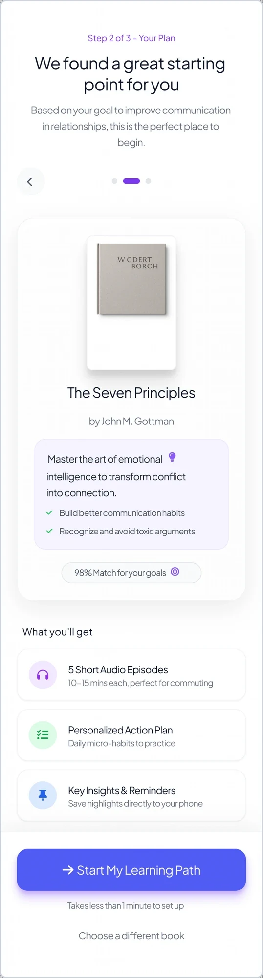
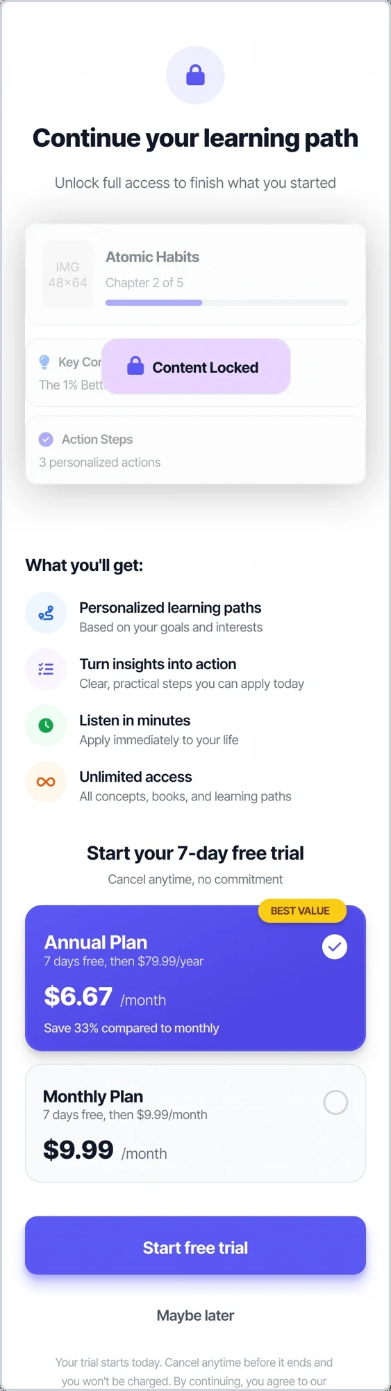
I reworked the first-run experience to demonstrate the core value up front instead of generic setup — from picking topics and books to a matched plan, habit reminders, and a value-framed trial. Shown here in order.
Polishing and extending the design
Refining the existing UI and designing new, on-brand screens — including the value and positioning moments that make the product's promise clear — so every addition feels like part of one coherent experience.
New feature screens
Two examples of extending the design language into fresh moments: a value-first intro that frames the core promise, and a positioning screen that shows why natural, podcast-style summaries beat both dense books and robotic audio.
/ 06 — Key decisions
Decisions that
led with value.
A few choices made the AI feel approachable and the product worth paying for.
Led onboarding with value, not setup
Restructured the first-run flow so users see what Dialogue does for them before any configuration.
Made AI features conversational, not technical
Designed the 'ask a book' flows around natural, guided interactions so the AI felt approachable rather than intimidating.
Kept new capabilities native to the product
Every new feature screen matched the existing design language, so additions felt built-in rather than bolted on.
Reduced friction to first value
Cut unnecessary steps between opening the app and experiencing a personalized result.
/ 07 — Outcome
Value, understood
faster.
The redesigned onboarding and clearer feature flows helped users understand the product's value faster — reducing early drop-off, improving onboarding completion, and lifting conversion to paid. New users reached a meaningful 'first result' moment sooner, and the AI features shipped as a coherent, intuitive part of the experience rather than an add-on.
/ 08 — Reflection
This project shows my strength in bringing clarity and usable structure to AI features inside a live product — leading with user value and making new capabilities feel effortless.